Color trends in architecture and product design do not emerge randomly. They are the product of deliberate forecasting processes conducted by color institutes, coating manufacturers, design agencies, and trend research organizations that analyze cultural shifts, economic conditions, environmental concerns, and technological developments to predict which colors will resonate with designers and consumers in the coming seasons. These forecasts influence everything from the colors available in powder coating manufacturers' standard ranges to the palettes specified by architects for major building projects.
Design
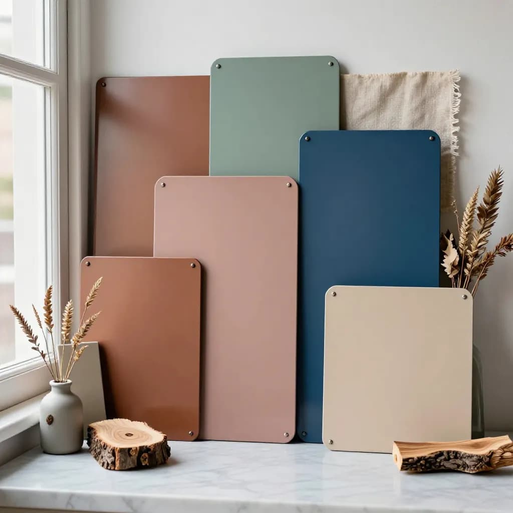
Powder Coating Color Trends 2026: Earth Tones, Biophilic Design, and the Rise of Matte
Sundial Powder Coating·April 22, 2026·12 min
For the powder coating industry, color trends have direct commercial implications. Manufacturers invest in developing new color formulations, effect pigments, and finish combinations that align with forecasted trends, ensuring that their product ranges remain relevant and appealing to specifiers. Architectural coating companies like AkzoNobel, Axalta, Tiger Coatings, and Sherwin-Williams publish annual or biennial color trend collections that translate broad design movements into specific powder coating colors with RAL, NCS, or proprietary color codes.
Ready to Start Your Project?
From one-off customs to 15,000-part production runs — get precise pricing in 24 hours.
On This Page
How Color Trends Shape Architectural Specification
Understanding color trends helps architects, designers, and specifiers make informed choices that will age well over the lifespan of a building or product. A color that feels fresh and contemporary at the time of specification should still look appropriate a decade later. This is why architectural color trends tend to evolve more slowly than fashion or interior design trends — building facades are not repainted every season. The trends discussed here represent broad directional shifts that have been building for several years and are expected to define the architectural color landscape through 2026 and beyond.
Earth Tones: The Dominant Palette of 2026
Earth tones have moved from a supporting role to the dominant position in architectural color specification, and 2026 marks the full maturation of this trend. Warm browns, terracottas, ochres, olive greens, clay reds, and sandy beiges are appearing on facades, window frames, cladding panels, and entrance systems across residential, commercial, and institutional projects worldwide. This palette draws directly from the natural landscape — soil, stone, clay, dried grasses, and weathered wood — creating buildings that feel grounded, warm, and connected to their environment.
The earth tone trend is driven by several converging forces. The biophilic design movement, which seeks to strengthen the connection between built environments and nature, naturally gravitates toward colors found in the natural world. Sustainability consciousness encourages materials and finishes that evoke natural, unprocessed materials rather than synthetic, industrial aesthetics. And after years of cool greys and stark whites dominating modern architecture, there is a collective desire for warmth and richness that earth tones provide.
In powder coating terms, the earth tone palette translates into specific color families. Warm browns in the RAL 8000 series — from light beige-brown to deep chocolate — are seeing increased specification. Terracotta and clay tones in the RAL 3000 and 8000 ranges offer rich, warm reds that reference traditional building materials. Olive and sage greens in the RAL 6000 series connect buildings to their landscape context. These colors are predominantly specified in matte or satin finishes, reinforcing the natural, tactile quality of the palette.
Biophilic Design and Its Influence on Color
Biophilic design — the practice of incorporating natural elements, patterns, and experiences into the built environment — has moved from a niche academic concept to a mainstream design philosophy that is reshaping architectural specification at every scale. Research consistently demonstrates that exposure to natural elements in buildings improves occupant wellbeing, reduces stress, enhances cognitive function, and increases productivity. Color is one of the most accessible tools for introducing biophilic qualities into a building, and the powder coating industry is responding with expanded natural color palettes.
Biophilic color specification goes beyond simply choosing green for vegetation or brown for earth. It involves understanding the full chromatic range of natural environments and translating those colors into architectural finishes. A forest palette might include deep moss greens, warm bark browns, dappled golden yellows, and cool shadow greys. A coastal palette might combine sandy beiges, driftwood greys, sea-glass blues, and salt-white accents. A desert palette might feature warm sandstone yellows, burnt sienna reds, sage greens, and deep sky blues.
Powder coating manufacturers are developing curated biophilic color collections that group colors into nature-inspired palettes, making it easier for architects to specify cohesive color schemes that evoke specific natural environments. These collections often include coordinated colors across different finish types — matte for primary surfaces, satin for accents, textured for feature elements — allowing designers to create multi-dimensional biophilic experiences using a single coating technology. The trend extends beyond exterior facades to interior architectural elements, furniture, and fixtures, creating continuity between outdoor and indoor environments.
The Continued Rise of Matte and Low-Gloss Finishes
The shift toward matte and low-gloss finishes that began several years ago has accelerated into 2026, becoming the default specification for a growing proportion of architectural and product design applications. Matte finishes — typically in the 5 to 20 gloss unit range at 60 degrees — are now more commonly specified than gloss finishes for building facades, window frames, and cladding panels in many markets. This represents a significant shift from the high-gloss aesthetic that dominated architectural finishing for decades.
The appeal of matte finishes is both aesthetic and practical. Visually, matte surfaces create a calm, sophisticated appearance that emphasizes form and material quality over surface reflectivity. They reduce glare from sunlight, minimize the visibility of surface contamination between cleaning cycles, and create a more uniform appearance across large facade areas where gloss variation between panels would be distracting. The tactile quality of matte finishes — they feel softer and more substantial to the touch than gloss surfaces — aligns with the broader design trend toward sensory, experiential architecture.
Powder coating technology has responded to this demand with significant improvements in matte formulation. Modern matte powders offer better consistency, improved resistance to fingerprinting and marking, and enhanced cleanability compared to earlier generations. Ultra-matte formulations below 5 GU are now available in a wide range of colors, including the earth tones and biophilic palettes that define the current trend. The combination of matte finish with warm, natural colors creates a material quality that references natural stone, clay, and unfinished wood — exactly the aesthetic that biophilic and earth-tone design trends demand.
Color of the Year and Its Ripple Effect
Each year, major color authorities — Pantone, AkzoNobel, Benjamin Moore, Sherwin-Williams, and others — announce their Color of the Year selections, generating significant media attention and influencing design decisions across industries. While these selections are primarily aimed at interior design, fashion, and consumer products, they create a ripple effect that reaches architectural specification and powder coating selection, particularly for accent colors and feature elements.
The mechanism of influence is indirect but real. When a Color of the Year is announced, it validates and amplifies a color direction that trend forecasters have already identified as emerging. Designers and architects who are already considering that color direction feel confirmed in their choice, and those who were not yet aware of the trend become exposed to it. Over the following 12 to 24 months, the color and its related palette appear with increasing frequency in material specifications, product launches, and built projects.
For 2026, the Color of the Year selections from major authorities have converged around warm, grounded tones — soft terracottas, warm taupes, and muted golden hues — reinforcing the earth tone and biophilic trends already underway. Powder coating manufacturers have responded by ensuring these specific hues are available in their architectural ranges, often with multiple finish options (matte, satin, textured) to give specifiers flexibility. The practical impact for architects is that these trending colors are readily available from multiple powder suppliers, well-supported with color matching services, and likely to remain in production for the foreseeable future.
Emerging Accent Colors and Contrast Strategies
While earth tones and muted naturals dominate the primary palette for 2026, the accent color story adds energy and individuality to architectural schemes. Deep, saturated accent colors — forest green, navy blue, burnt orange, and deep plum — are being used strategically on entrance features, signage, window reveals, and architectural details to create focal points against neutral earth-tone backgrounds. These accents are typically specified in satin or semi-gloss finishes to differentiate them from the matte primary surfaces.
Black continues to play a significant role as both a primary and accent color, but the character of architectural black is evolving. The trend is moving away from blue-black and cool-toned blacks toward warm blacks with brown or green undertones that harmonize with earth-tone palettes. Matte black — sometimes called "soft black" or "warm black" — is specified for window frames, mullions, and metal trim where a strong but not harsh contrast is desired against warm facade colors.
Contrast strategies are becoming more sophisticated. Rather than simple light-dark contrast, architects are exploring tone-on-tone combinations where multiple shades of the same color family create subtle depth and visual interest. A facade might combine three or four shades of warm grey-brown, from light sand to deep umber, creating a rich, layered appearance that references natural stone variation. Powder coating's ability to produce precise, repeatable colors across large quantities makes these multi-tone schemes practical, and the availability of colors in matched matte, satin, and textured finishes adds another dimension of contrast.
Regional Variations in Color Trends
While the broad direction of color trends is global, regional variations reflect local climate, cultural preferences, architectural traditions, and material availability. Understanding these regional nuances helps specifiers choose colors that feel appropriate to their specific context rather than simply following a global trend.
In Northern Europe and Scandinavia, the earth tone trend manifests as muted, cool-leaning naturals — grey-greens, blue-greys, and soft whites that reference the Nordic landscape of stone, lichen, and winter light. Warm terracottas and ochres are used more sparingly, typically as accent colors rather than primary facade tones. The Scandinavian preference for understated, nature-connected design aligns naturally with biophilic principles, and matte finishes have been the default specification in this region for longer than in most other markets.
In Southern Europe and the Mediterranean, warmer earth tones dominate — terracotta, warm sand, golden ochre, and olive green reference the regional landscape and traditional building materials. These colors are often specified in slightly higher gloss levels (satin rather than dead matte) to reflect the stronger sunlight and create a livelier surface appearance. In the Middle East and North Africa, sand and stone tones are perennial favorites, but there is growing interest in deeper, more saturated earth tones and in metallic accents that reference traditional Islamic architectural decoration.
In Asia-Pacific markets, the earth tone trend is blending with regional preferences for clean, precise aesthetics. Warm greys, soft bronzes, and muted golds are popular choices that bridge the gap between the global earth tone movement and the local preference for refined, contemporary finishes. The Australian market, with its strong connection to landscape and outdoor living, has embraced the biophilic palette enthusiastically, with colors referencing the distinctive Australian landscape of red earth, eucalyptus green, and coastal blue.
Frequently Asked Questions
What are the dominant powder coating colors for 2026?
Earth tones dominate the 2026 palette — warm browns, terracottas, ochres, olive greens, clay reds, and sandy beiges. These colors are driven by biophilic design principles and a desire for warmth and natural connection in architecture. They are predominantly specified in matte or satin finishes.
How does biophilic design influence powder coating color selection?
Biophilic design seeks to connect built environments with nature, which naturally gravitates toward colors found in natural landscapes — forest greens, earth browns, sky blues, and stone greys. Powder coating manufacturers are developing curated biophilic color collections grouped into nature-inspired palettes to support this design approach.
Why are matte finishes so popular in 2026?
Matte finishes create a calm, sophisticated appearance that emphasizes form over reflectivity, reduces glare, hides surface contamination, and provides a tactile quality that aligns with current design preferences for sensory, natural-feeling materials. Modern matte powder formulations have also improved in consistency and cleanability.
Do Color of the Year selections affect architectural specification?
Yes, indirectly. Color of the Year announcements validate emerging color directions and increase designer awareness of specific hues. Powder coating manufacturers ensure trending colors are available in their architectural ranges, making them readily accessible for specification. The influence is strongest on accent colors and feature elements.
Are color trends the same worldwide?
Broad trends are global, but regional variations reflect local climate, culture, and architectural traditions. Northern Europe favors cool-leaning naturals, Southern Europe prefers warmer terracottas and ochres, and Asia-Pacific markets blend earth tones with clean, precise aesthetics. Understanding regional context helps specifiers choose appropriate colors.
Ready to Start Your Project?
From one-off customs to 15,000-part production runs — get precise pricing in 24 hours.