Color communication is one of the most challenging aspects of powder coating specification. What one person calls 'dark grey' another might describe as 'charcoal' or 'anthracite' — and all three might be imagining different colors. Color standard systems solve this problem by assigning unique, unambiguous identifiers to specific colors, enabling precise communication between designers, specifiers, manufacturers, and coating applicators without relying on subjective descriptions.
Technical
Powder Coating Color Standards: RAL, NCS, Pantone, Munsell, and Custom Matching
Sundial Powder Coating·April 22, 2026·13 min
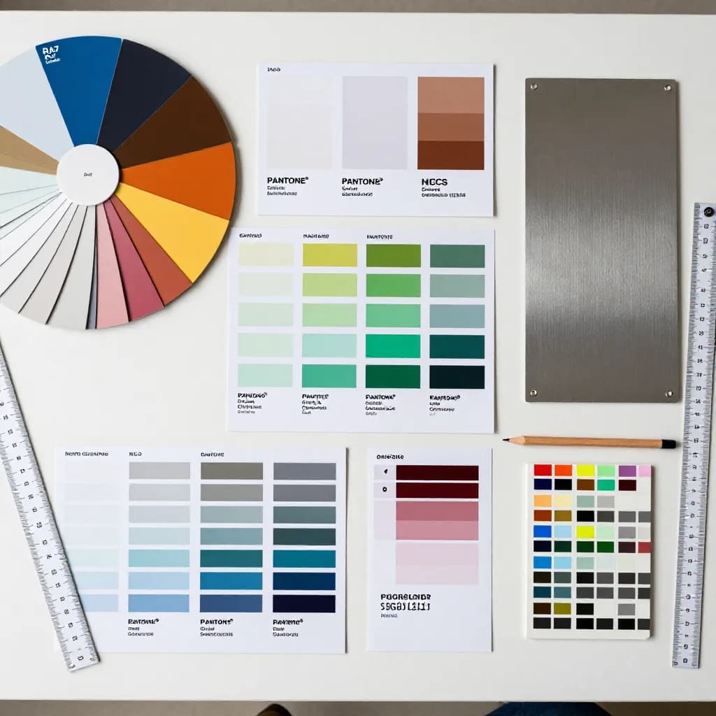
In the powder coating industry, several color standard systems are in common use, each with different origins, structures, and strengths. The choice of color system affects not only how you communicate color requirements but also the availability and lead time of the powder product, the precision of color matching, and the cost of the coating. Understanding the major color systems and when to use each one is essential knowledge for anyone specifying or purchasing powder coating services.
Ready to Start Your Project?
From one-off customs to 15,000-part production runs — get precise pricing in 24 hours.
On This Page
Why Color Standards Matter in Powder Coating
This guide covers the five most important color standard systems for powder coating: RAL (in its Classic, Design, and Effect variants), NCS (Natural Color System), Pantone, Munsell, and custom color matching. For each system, we explain its structure, its strengths and limitations for powder coating applications, and the practical considerations for specifying colors within that system.
RAL Classic: The Industry Standard
RAL Classic is the most widely used color standard system in the European powder coating industry and is recognized globally. Developed by the German RAL Institute, the system comprises 215 standardized colors, each identified by a four-digit number (for example, RAL 9010 Pure White, RAL 7016 Anthracite Grey, RAL 5015 Sky Blue). The system is organized into color ranges: 1000s (yellows), 2000s (oranges), 3000s (reds), 4000s (violets), 5000s (blues), 6000s (greens), 7000s (greys), 8000s (browns), and 9000s (whites and blacks).
The primary advantage of RAL Classic for powder coating is universal availability. Every major powder manufacturer produces their full product range in RAL Classic colors, and most standard RAL colors are available from stock with short lead times. This means that specifying a RAL Classic color virtually guarantees that the powder will be readily available, that multiple suppliers can quote competitively, and that replacement or additional powder can be sourced quickly if needed.
RAL Classic colors are defined by physical color samples (the RAL K7 fan deck or RAL K5 semi-matte and high-gloss cards) rather than by spectrophotometric data alone. This means that the definitive reference for a RAL color is the physical sample, and instrumental color measurements are used to verify conformance rather than to define the color. When specifying RAL Classic colors, always reference the RAL number and verify against a current physical sample — RAL samples can fade or shift over time, so use samples that are in good condition and have been stored away from light.
RAL Design and RAL Effect: Extended Color Palettes
RAL Design extends the RAL color system to 1,825 colors organized in a three-dimensional color space based on hue (H), lightness (L), and chroma (C). Each RAL Design color is identified by a seven-digit code — for example, RAL 210 50 25 describes a color with hue 210 (blue-green), lightness 50 (medium), and chroma 25 (moderate saturation). This systematic organization makes it easy to find colors with specific characteristics or to select harmonious color combinations based on their position in the color space.
RAL Design is particularly useful for architects and designers who need access to a broader color palette than RAL Classic provides, or who want to select colors based on systematic relationships rather than browsing a limited catalog. The system covers a much wider range of hues, lightness levels, and saturation levels than RAL Classic, filling the gaps between the 215 Classic colors with a comprehensive, evenly spaced color grid.
RAL Effect is a newer addition to the RAL family, comprising 420 solid colors and 70 metallic effect colors. The solid colors in RAL Effect are inspired by natural materials and contemporary design trends, while the metallic colors incorporate aluminum flake pigments for a sparkling, metallic appearance. RAL Effect colors are identified by a three-digit number followed by a dash and a one or two-digit suffix (for example, RAL 110-1 for a solid color or RAL 510-M for a metallic color).
Both RAL Design and RAL Effect colors are available from major powder manufacturers, but availability may be more limited than for RAL Classic colors — some may require custom production rather than being available from stock. Confirm powder availability and lead time with your supplier before specifying RAL Design or RAL Effect colors for production orders.
NCS: The Natural Color System
The Natural Color System (NCS) is based on how humans perceive color rather than on the physics of light or pigment mixing. Developed in Sweden, NCS describes colors in terms of their visual similarity to six elementary colors — white, black, yellow, red, blue, and green — that are considered perceptual anchors in human color vision. Every NCS color is described by its blackness, chromaticness, and hue, expressed in a notation like NCS S 2060-Y90R (a strong, vivid red-orange).
NCS is widely used in Scandinavian countries and is gaining adoption across Europe, particularly in architectural and interior design applications. Its perceptual basis makes it intuitive for designers — colors that look similar are close together in the NCS system, and the notation directly describes the visual character of the color. This makes NCS particularly useful for selecting color palettes, specifying color relationships, and communicating color intent to non-technical stakeholders.
For powder coating applications, NCS colors can be matched by all major powder manufacturers, but they are not typically held as standard stock colors. Specifying an NCS color for powder coating usually requires custom color matching — the powder manufacturer formulates a powder to match the NCS reference sample, which adds lead time and may involve minimum order quantities for the custom powder. If you prefer to specify in NCS but want the availability advantages of RAL, many color reference tools provide cross-references between NCS and RAL colors, allowing you to identify the closest RAL Classic equivalent to your NCS selection.
Pantone and Munsell: Specialized Applications
The Pantone Matching System (PMS) is the dominant color standard in graphic design, printing, and brand identity, but its application to powder coating requires careful management. Pantone colors are defined for ink on paper, and the visual appearance of a Pantone color printed on coated paper stock is fundamentally different from the same color formulated as a powder coating on metal. The substrate, surface texture, gloss level, and viewing conditions all affect how the color appears, and a powder coating matched to a Pantone reference may look noticeably different from the Pantone swatch.
Despite these limitations, Pantone specifications are common in powder coating because many products must match brand colors that are defined in the Pantone system. When specifying Pantone colors for powder coating, always request physical powder-coated samples for approval rather than relying on the Pantone swatch as the acceptance standard. Specify an acceptable Delta E tolerance between the powder-coated sample and the Pantone reference, and evaluate samples under the lighting conditions in which the finished product will be viewed.
The Munsell Color System is a perceptual color system that describes colors in terms of hue, value (lightness), and chroma (saturation). While less commonly used than RAL or NCS in commercial powder coating specification, Munsell is the reference system for several important applications — including US federal and military color standards (Federal Standard 595, now superseded by AMS-STD-595) and soil color classification. If your application requires compliance with Munsell-referenced color standards, powder manufacturers can match Munsell specifications through custom color formulation. As with NCS and Pantone, custom matching adds lead time and may involve minimum order quantities.
Custom Color Matching: Process and Considerations
When no standard color system contains the exact color you need, custom color matching allows you to create a powder coating in virtually any color. The process begins with submitting a physical color reference to the powder manufacturer — this can be a painted sample, a fabric swatch, a plastic component, a natural material sample, or any other physical object that represents the target color.
The powder manufacturer's color laboratory analyzes the reference using a spectrophotometer to measure its color coordinates, then formulates a trial powder batch designed to match those coordinates when applied and cured on the specified substrate. The trial powder is applied to sample panels and compared against the reference — both instrumentally (measuring Delta E) and visually (assessing appearance under standard lighting conditions). If the first match is not acceptable, the formulation is adjusted and new samples are produced. This iterative process typically requires one to three rounds of adjustment to achieve an acceptable match.
Several factors affect the achievability and cost of custom color matching. Very saturated, vivid colors may be difficult to achieve in powder coating because the available pigment systems have inherent limitations in chroma. Colors that rely on fluorescent or phosphorescent effects in the reference material cannot be replicated in standard powder coatings. Metallic and pearlescent references require special-effect powders that add complexity and cost. The substrate material and surface finish affect color appearance, so always specify the actual production substrate when requesting custom matching — a match developed on a smooth aluminum panel may not look the same on a textured steel surface.
Choosing the Right Color System for Your Application
The choice of color system should be guided by the application, the market, and the practical requirements of the project. For general industrial and commercial applications in Europe, RAL Classic is the default choice — it offers the widest powder availability, the shortest lead times, and universal recognition across the supply chain. If the 215 RAL Classic colors do not include the exact shade you need, RAL Design provides a much broader palette while maintaining the RAL system's industry recognition.
For architectural projects, the choice often depends on the geographic market and the design team's preferences. European architectural projects commonly use RAL Classic or RAL Design, while Scandinavian projects frequently specify NCS. North American projects may use any system, with custom color matching being particularly common. For projects where the coating must match other building materials (stone, brick, timber, or other cladding), custom matching to a physical sample of the adjacent material is often the most effective approach.
For branded products where the color must match a corporate identity, the brand's color specification determines the system — typically Pantone for global brands. In these cases, the powder coating must be matched to the brand reference, and the approval process should involve both instrumental measurement and visual evaluation by the brand owner. For military, government, and regulated applications, the specified color system (often Munsell or Federal Standard) must be used, and compliance documentation may be required.
Regardless of the color system chosen, always base final approval on physical powder-coated samples evaluated under appropriate lighting conditions. No color system, no matter how precise, can fully predict the appearance of a powder coating on a specific substrate — the sample approval process is the essential final step in translating a color specification into a production reality.
Frequently Asked Questions
Which color system is most commonly used for powder coating?
RAL Classic is the most widely used color system in the powder coating industry, particularly in Europe. Its 215 colors are universally available from all major powder manufacturers as standard stock colors, providing the best combination of availability, lead time, and industry recognition.
Can I specify a Pantone color for powder coating?
Yes, but with important caveats. Pantone colors are defined for ink on paper, and the appearance on a powder-coated metal surface will differ. Always evaluate physical powder-coated samples rather than relying on the Pantone swatch. Specify a Delta E tolerance and approve samples under the actual viewing conditions.
How long does custom color matching take?
Initial custom color development typically takes two to four weeks from submission of the physical reference to delivery of sample panels. Each revision cycle adds one to two weeks. Simple solid colors match faster than metallics or special effects. Allow adequate time in your project schedule for the matching and approval process.
What is the difference between RAL Classic and RAL Design?
RAL Classic contains 215 colors identified by four-digit numbers, organized by color family. RAL Design contains 1,825 colors organized systematically by hue, lightness, and chroma. RAL Design offers a much broader palette and systematic color relationships, but powder availability may be more limited than for RAL Classic colors.
Why does the same color look different on different substrates?
Substrate material, surface roughness, alloy composition, and pretreatment all affect how light interacts with the coating, influencing the perceived color. A smooth aluminum surface reflects light differently than a textured steel surface, even with identical powder applied at the same thickness. Always evaluate color samples on the actual production substrate.
Ready to Start Your Project?
From one-off customs to 15,000-part production runs — get precise pricing in 24 hours.