Color is not merely a visual phenomenon — it is a physiological and psychological experience that influences how people feel, think, and behave within a space. When light of a specific wavelength enters the eye, it triggers signals that travel not only to the visual cortex for image processing but also to the hypothalamus, which regulates the autonomic nervous system, hormonal activity, and circadian rhythms. This dual pathway means that color can affect the body directly, independent of conscious aesthetic judgment.
Design
Color Psychology in Architecture and Design: How Color Shapes Space and Experience
Sundial Powder Coating·April 20, 2026·15 min
Research in environmental psychology has consistently demonstrated that warm colors (red, orange, yellow) tend to activate the sympathetic nervous system, increasing heart rate, blood pressure, and perceived temperature. Cool colors (blue, green, violet) activate the parasympathetic nervous system, promoting relaxation, lowering heart rate, and reducing perceived temperature. These responses are measurable and largely involuntary, which is why color selection in architecture is not simply a matter of taste — it is a functional design decision with real consequences for occupant wellbeing and behavior.
Ready to Start Your Project?
From one-off customs to 15,000-part production runs — get precise pricing in 24 hours.
On This Page
The Science of Color and Emotion
It is important to acknowledge that color perception is not universal. Cultural associations with color vary significantly across societies. White symbolizes purity and cleanliness in Western cultures but is associated with mourning in many East Asian traditions. Red signifies luck and prosperity in Chinese culture but can signal danger or prohibition in Western contexts. Green carries strong associations with nature and Islam in the Middle East, while in Western design it is primarily linked to health, growth, and environmental sustainability. Architects working on international projects must consider these cultural dimensions alongside the physiological effects of color to create spaces that resonate appropriately with their intended users.
The saturation and brightness of a color are as important as its hue in determining psychological impact. Highly saturated, vivid colors create stronger emotional responses and can feel energizing or overwhelming depending on the context. Desaturated, muted tones feel calmer and more sophisticated. Light tints expand perceived space and promote openness, while dark shades create intimacy and enclosure. Understanding these dimensions allows designers to fine-tune the emotional character of a space with precision.
Warm Colors in Architecture: Red, Orange, Yellow
Red is the most physiologically stimulating color in the visible spectrum. Studies have shown that exposure to red environments increases heart rate, raises blood pressure, and stimulates appetite. In architectural applications, red is a powerful accent color that draws attention, creates focal points, and encourages social interaction. Restaurants and dining spaces have long used red to stimulate appetite and conversation — the warm, energetic atmosphere it creates encourages diners to linger and enjoy their meals. However, red should be used sparingly in spaces where calm concentration is required, as its stimulating properties can increase anxiety and reduce focus in sustained-attention tasks.
In architectural facades, red is a bold statement that commands attention. RAL 3000 Flame Red and RAL 3020 Traffic Red are frequently specified for accent panels, entrance features, and wayfinding elements on commercial and institutional buildings. The key to using red effectively in architecture is restraint — a single red wall, a red-framed entrance, or red cladding panels on an otherwise neutral facade creates visual impact without overwhelming the composition.
Orange combines the energy of red with the optimism of yellow, creating a color that conveys warmth, creativity, and sociability. In workplace design, orange is increasingly used in collaborative spaces, breakout areas, and innovation labs where creative thinking and informal interaction are encouraged. Orange stimulates mental activity and promotes a sense of enthusiasm without the aggressive intensity of red. In educational environments, orange can energize learning spaces and encourage participation.
Yellow is the color most strongly associated with optimism, alertness, and mental clarity. It is the first color the human eye processes, which is why it is used universally for caution signs and high-visibility applications. In architecture, yellow works well in entryways, corridors, and transitional spaces where it creates a welcoming, uplifting first impression. Kitchens and breakfast rooms benefit from yellow's association with morning energy and cheerfulness. However, research suggests that prolonged exposure to highly saturated yellow can increase anxiety and agitation — a phenomenon sometimes called the yellow room effect. For this reason, softer tones such as RAL 1015 Light Ivory or RAL 1013 Oyster White are preferred over vivid yellows for large surface areas in occupied spaces.
Cool Colors in Architecture: Blue, Green, Violet
Blue is consistently rated as the most universally preferred color across cultures and demographics. Its calming effect on the autonomic nervous system — lowering heart rate, reducing blood pressure, and slowing respiration — makes it an ideal choice for spaces where concentration, tranquility, or recovery are priorities. Office environments benefit from blue's ability to enhance focus and productivity without creating the drowsiness associated with very dark or very warm color schemes. Healthcare facilities use blue extensively in waiting areas, consultation rooms, and staff spaces to reduce patient anxiety and promote a sense of trust and professionalism.
In architectural exteriors, blue is less common than neutral tones but can create striking effects when used thoughtfully. RAL 5024 Pastel Blue offers a soft, approachable tone for educational and healthcare buildings, while RAL 5015 Sky Blue provides a more vivid option for recreational and commercial facades. Deep blues such as RAL 5003 Sapphire Blue convey authority and permanence, making them suitable for corporate and institutional buildings.
Green occupies a unique position in the color spectrum as the color the human eye is most sensitive to and the one most strongly associated with the natural world. Biophilic design — the practice of incorporating natural elements and patterns into the built environment — has elevated green from a secondary palette color to a primary design tool. Green environments reduce stress, lower eye strain, and promote a sense of balance and restoration. Hospitals and healthcare facilities increasingly use soft greens in patient rooms and recovery areas based on evidence that green environments support faster healing and reduced anxiety. Schools use green in classrooms and common areas to create calm, focused learning environments.
Violet and purple tones occupy the boundary between warm and cool, combining the calming properties of blue with a subtle energy that stimulates creative and contemplative thinking. In architectural design, violet is used in meditation spaces, creative studios, art galleries, and spiritual environments where introspection and imagination are valued. Lighter lavender tones create a sense of gentle luxury and refinement, while deeper purples convey richness and drama. RAL 4009 Pastel Violet offers a sophisticated, muted option for interior accent walls and feature elements.
Neutral Colors: The Foundation of Architectural Palettes
Neutral colors — white, grey, beige, cream, and black — form the backbone of most architectural color schemes. They provide visual continuity, allow accent colors to stand out, and create the spatial framework within which more expressive colors can operate. The choice of neutral palette sets the fundamental character of a building or interior, establishing whether the space feels modern or traditional, warm or cool, expansive or intimate.
White is the most widely used color in architecture, valued for its ability to maximize the perception of space, reflect natural light, and create a clean, uncluttered aesthetic. In interior design, white walls and ceilings make rooms feel larger and brighter, which is particularly valuable in compact urban spaces. However, all-white environments can feel sterile, clinical, or cold if not balanced with warm materials, textures, and accent colors. The specific shade of white matters enormously — a warm white with yellow or cream undertones (such as RAL 9001 Cream or RAL 9010 Pure White) feels inviting and comfortable, while a cool blue-white (such as RAL 9003 Signal White) feels crisp and modern but can appear harsh under certain lighting conditions.
Grey has become the defining neutral of contemporary architecture. RAL 7016 Anthracite Grey, in particular, has emerged as one of the most specified colors for modern building facades, window frames, and architectural metalwork. Its deep, sophisticated tone provides a strong visual anchor that complements both natural materials (wood, stone, brick) and bold accent colors. The popularity of anthracite grey reflects broader design trends toward dark, dramatic facades that contrast with lighter interior spaces. Lighter greys such as RAL 7035 Light Grey and RAL 7047 Telegrey 4 remain popular for industrial, commercial, and healthcare applications where a clean, professional appearance is required without the starkness of white.
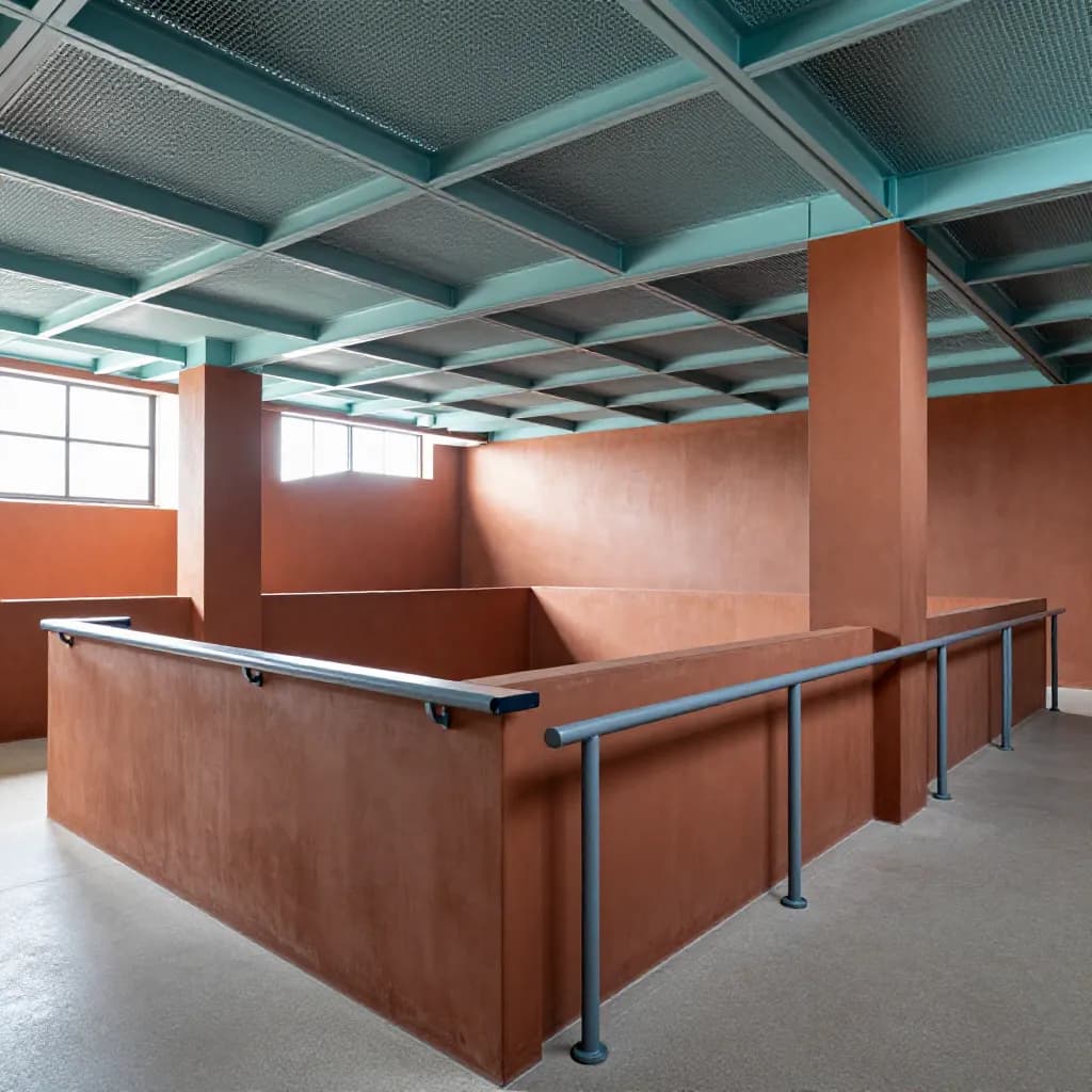
Beige and cream tones provide warmth and comfort that grey and white cannot match. These colors are associated with natural materials — sandstone, limestone, clay, linen — and create environments that feel grounded, welcoming, and timeless. RAL 1015 Light Ivory and RAL 1013 Oyster White are widely used in residential, hospitality, and commercial interiors where a warm, approachable atmosphere is desired. Black, used as an accent or in limited applications, adds drama, luxury, and visual weight. RAL 9005 Jet Black is specified for window frames, railings, and architectural details where a sharp, defined contrast is needed. Full black facades, while increasingly popular in contemporary residential architecture, require careful consideration of heat absorption and thermal performance.
Color in Healthcare Design
Healthcare environments present some of the most demanding color design challenges in architecture. The color palette must simultaneously support patient recovery, reduce anxiety, facilitate wayfinding, promote staff wellbeing during long shifts, and meet stringent hygiene and maintenance requirements. Evidence-based design research has produced a growing body of knowledge about how color affects clinical outcomes, and progressive healthcare organizations are incorporating these findings into their facility design standards.
Soft greens and blues are the most widely recommended colors for patient care areas. Research published in the Journal of Environmental Psychology and other peer-reviewed sources has shown that patients in rooms with soft green or blue walls report lower anxiety levels, perceive less pain, and rate their care experience more positively than patients in rooms with neutral or warm-colored walls. RAL 6019 Pastel Green is frequently specified for patient rooms, recovery areas, and treatment spaces where a calming, restorative atmosphere is the priority. Soft blues such as RAL 5024 Pastel Blue serve a similar function and are particularly effective in mental health facilities where reducing agitation is a clinical priority.
Warm neutrals play an important role in making healthcare environments feel less institutional and more welcoming. Patient rooms, family waiting areas, and consultation spaces benefit from warm beige, cream, and soft taupe tones that create a sense of comfort and domesticity. The trend in modern healthcare design is away from the stark white corridors and clinical green walls of previous generations toward warmer, more residential color palettes that support the psychological wellbeing of patients and families during stressful experiences.
Color-coded wayfinding is a critical functional application of color in healthcare facilities. Large hospitals and medical centers use distinct color zones to help patients, visitors, and staff navigate complex floor plans. Each department or wing is assigned a signature color that appears on walls, floor markings, signage, and door frames, creating an intuitive navigation system that reduces confusion and anxiety. High contrast between text, signage, and background colors is essential for accessibility, ensuring that wayfinding systems are usable by people with visual impairments. The Americans with Disabilities Act (ADA) and similar accessibility standards require minimum contrast ratios that must be considered when selecting wayfinding color palettes.
Color in Workplace Design
The modern workplace is a complex environment that must support diverse activities — focused individual work, collaborative teamwork, creative brainstorming, informal socializing, and quiet restoration. Color zoning, the practice of using different color palettes for different functional areas, has become a key strategy for creating workplaces that support this range of activities without physical barriers.
Blue is the most recommended color for focused work environments. Its calming, concentration-enhancing properties make it ideal for individual workstations, private offices, and quiet zones where sustained attention is required. Studies conducted by the University of British Columbia found that blue environments improved performance on creative tasks requiring careful attention to detail. The shade matters — medium blues provide the best balance of calm and alertness, while very dark blues can feel oppressive and very light blues may lack sufficient visual interest to maintain engagement.
Green is increasingly used in workplace design as awareness of biophilic design principles grows. Green reduces eye strain — a significant benefit in screen-intensive work environments — and promotes a sense of balance and wellbeing that supports sustained productivity over long work days. Living green walls, potted plants, and green accent surfaces work together to create a connection to nature that research consistently links to reduced stress, improved mood, and higher job satisfaction. RAL 6021 Pale Green and RAL 6019 Pastel Green offer soft, natural tones that complement biophilic design elements without dominating the space.
Yellow and orange are best reserved for collaborative and creative spaces where energy, optimism, and social interaction are desired. Meeting rooms, brainstorming areas, and informal breakout spaces benefit from warm accent colors that stimulate conversation and creative thinking. However, these colors should be used as accents rather than dominant wall colors — a yellow feature wall or orange furniture in an otherwise neutral space provides the desired energy without the overstimulation that large areas of warm color can produce. Neutral base palettes with strategic color accents give organizations the flexibility to adapt spaces as work patterns evolve, without requiring complete redecoration.
Color in Retail and Hospitality
Retail and hospitality environments use color strategically to influence customer behavior, reinforce brand identity, and create memorable experiences. The psychological effects of color on purchasing decisions, appetite, perceived wait times, and brand perception have been extensively studied, and the findings inform the design of everything from fast-food restaurants to luxury hotel lobbies.
Warm colors — particularly red, orange, and warm yellow — are proven to stimulate appetite and encourage spending. Fast-food and casual dining restaurants overwhelmingly use warm color palettes to create energetic, appetite-stimulating environments that encourage quick turnover. The combination of red and yellow, used by numerous global fast-food brands, is no accident — it simultaneously stimulates hunger and creates a sense of urgency that promotes faster eating and higher table turnover. Fine dining establishments, by contrast, use deeper, more muted warm tones — burgundy, terracotta, warm gold — to create intimate, luxurious atmospheres that encourage guests to relax, linger, and order additional courses.
Cool colors build trust, convey professionalism, and create a sense of calm reliability. Financial services firms, law offices, and healthcare providers frequently use blue-dominant palettes to reinforce perceptions of competence and trustworthiness. Technology companies often combine cool blues with clean whites and bright accent colors to project innovation and accessibility. The specific shade and saturation of blue communicates different brand attributes — navy conveys tradition and authority, while bright or electric blue suggests modernity and dynamism.
The psychology of luxury relies heavily on color to create perceptions of exclusivity, quality, and sophistication. Deep jewel tones — emerald green, sapphire blue, amethyst purple, ruby red — evoke richness and rarity. Metallic finishes in gold, bronze, and copper add warmth and opulence. Matte black creates drama and modernity. High-end hotels, boutiques, and premium retail environments use these colors in combination with rich materials and dramatic lighting to create immersive brand experiences. The key principle is restraint — luxury color palettes use fewer colors with greater intentionality, allowing each element to make a stronger impact.
Applying Color Psychology with RAL Colors
The RAL Classic color system provides a standardized, reproducible color language that allows architects, designers, and coating applicators to specify and deliver precise colors with confidence. With 215 colors in the RAL Classic range, the system covers the full spectrum of architectural color needs, from subtle neutrals to vivid accents. Understanding how specific RAL colors align with color psychology principles enables more intentional, evidence-informed design decisions.
For healthcare environments, RAL 6019 Pastel Green is one of the most frequently specified colors, offering the calming, restorative qualities of green in a soft, non-institutional tone. RAL 5024 Pastel Blue provides a similarly gentle option for areas where blue's anxiety-reducing properties are desired. RAL 1013 Oyster White and RAL 9001 Cream serve as warm neutral bases that prevent healthcare spaces from feeling cold or clinical. For wayfinding accents, more saturated RAL colors such as RAL 3020 Traffic Red, RAL 1023 Traffic Yellow, and RAL 5017 Traffic Blue provide the high visibility and contrast required for effective signage and zone identification.
For modern architectural facades, RAL 7016 Anthracite Grey has become the defining color of contemporary design, offering a sophisticated dark neutral that works equally well on residential, commercial, and institutional buildings. RAL 7021 Black Grey provides an even deeper option for architects seeking maximum drama without the heat absorption concerns of true black. RAL 9006 White Aluminium and RAL 9007 Grey Aluminium offer metallic-effect options that complement glass and metal curtain wall systems. For buildings that require warmth and approachability, RAL 1015 Light Ivory and RAL 7032 Pebble Grey provide inviting neutral tones that soften the appearance of large facade areas.
For commercial interiors, the RAL system offers precise control over accent color selection. RAL 5002 Ultramarine Blue and RAL 5005 Signal Blue provide strong, confident blues for corporate environments. RAL 6018 Yellow Green and RAL 6021 Pale Green support biophilic design themes. RAL 2004 Pure Orange and RAL 1028 Melon Yellow deliver the warm energy needed for collaborative and creative spaces. The ability to specify exact RAL codes ensures that the designer's color intent is faithfully reproduced by the coating applicator, eliminating the ambiguity that can arise from descriptive color names or uncalibrated color samples.
Color Trends in Contemporary Architecture
Architectural color trends reflect broader cultural shifts in how people relate to the built environment, nature, technology, and each other. Several significant trends are shaping color choices in contemporary architecture and interior design, and powder coating technology plays a central role in enabling these trends by offering virtually unlimited color options with consistent, durable finishes.
The shift toward warm neutrals is one of the most significant color trends in recent years. After a decade dominated by cool greys and stark whites, architects and designers are embracing warmer tones — soft beiges, warm taupes, terracotta, and sand — that create more inviting, human-centered spaces. This trend reflects a growing emphasis on wellbeing and comfort in architectural design, driven partly by the experience of spending more time at home during the pandemic years. Warm neutrals pair naturally with wood, stone, and other natural materials, supporting the broader movement toward biophilic and nature-inspired design.
Biophilic greens have moved from accent color to primary palette element as the evidence base for biophilic design continues to grow. Sage green, olive, moss, and forest green are appearing on facades, interior walls, cabinetry, and furniture in residential, commercial, and hospitality projects. These nature-inspired greens create a sense of connection to the outdoors that research consistently links to improved mental health, reduced stress, and enhanced cognitive performance. Powder coatings in matte and textured finishes enhance the organic, natural quality of green architectural elements.
Dark facades continue to gain popularity, with anthracite grey, charcoal, and near-black finishes dominating contemporary residential and commercial architecture. The dramatic contrast between dark exteriors and light, airy interiors creates a compelling architectural narrative that appeals to both designers and building occupants. Powder coating technology is particularly well suited to dark facade applications, as high-quality superdurable polyester formulations maintain their deep, rich color without the chalking and fading that can affect lesser coatings under intense UV exposure.
Bold accent colors are making a comeback after years of minimalist restraint. Architects are using vivid reds, deep blues, bright yellows, and saturated greens as strategic accents on entrance features, window reveals, balcony soffits, and cladding panels to create visual interest and identity on otherwise neutral buildings. This trend toward selective color boldness allows buildings to express personality and place-specific character while maintaining the sophisticated neutral base that contemporary design demands. Powder coating's ability to deliver any RAL color — plus custom colors and special effects — in a durable, consistent finish makes it the ideal technology for realizing these trend-responsive color choices.
Frequently Asked Questions
Does color really affect mood and behavior in buildings?
Yes. Research in environmental psychology has demonstrated measurable physiological and psychological responses to color. Warm colors increase heart rate and stimulate activity, while cool colors promote calm and concentration. These effects are mediated by the autonomic nervous system and occur largely independent of conscious awareness. While individual and cultural variations exist, the broad patterns are consistent across studies.
What is the best color for an office environment?
Blue is the most recommended color for focused work environments due to its calming, concentration-enhancing properties. Green is excellent for reducing eye strain in screen-intensive workplaces. The most effective approach is color zoning — using blue or green in focused work areas, warm accents in collaborative spaces, and neutral tones as a flexible base throughout. Avoid large areas of red or bright yellow in spaces where sustained concentration is required.
Why is RAL 7016 Anthracite Grey so popular in modern architecture?
RAL 7016 Anthracite Grey has become the signature color of contemporary architecture because it offers a deep, sophisticated neutral that complements virtually any material palette — glass, wood, stone, metal, and brick. It provides strong visual definition without the heat absorption concerns of true black, and its dark tone creates dramatic contrast with light interiors and natural surroundings. Its versatility across residential, commercial, and institutional buildings has made it the most specified dark neutral in European architecture.
What colors are recommended for healthcare facilities?
Soft greens (such as RAL 6019 Pastel Green) and soft blues (such as RAL 5024 Pastel Blue) are most recommended for patient care areas based on evidence that they reduce anxiety and support recovery. Warm neutrals create a welcoming, non-institutional atmosphere in patient rooms and family areas. High-contrast color coding is essential for wayfinding. Avoid highly saturated warm colors in clinical areas, as they can increase agitation and anxiety.
How does powder coating support architectural color trends?
Powder coating is uniquely suited to architectural color trends because it can reproduce any RAL Classic color — plus custom colors and special effects — in a durable, UV-resistant finish. Superdurable polyester powder coatings maintain color and gloss for decades on exterior facades, making them ideal for trend-responsive design choices. The technology also supports matte, textured, and metallic finishes that align with current preferences for natural, tactile surface qualities.
Ready to Start Your Project?
From one-off customs to 15,000-part production runs — get precise pricing in 24 hours.